Unleash the LEGACY of the BEAST Prints.

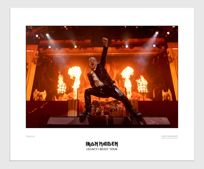
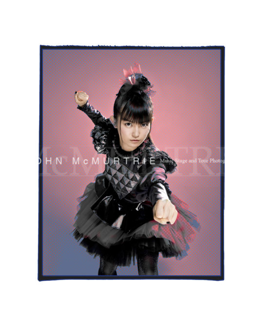
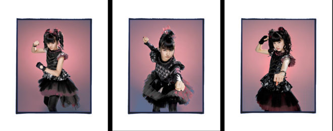
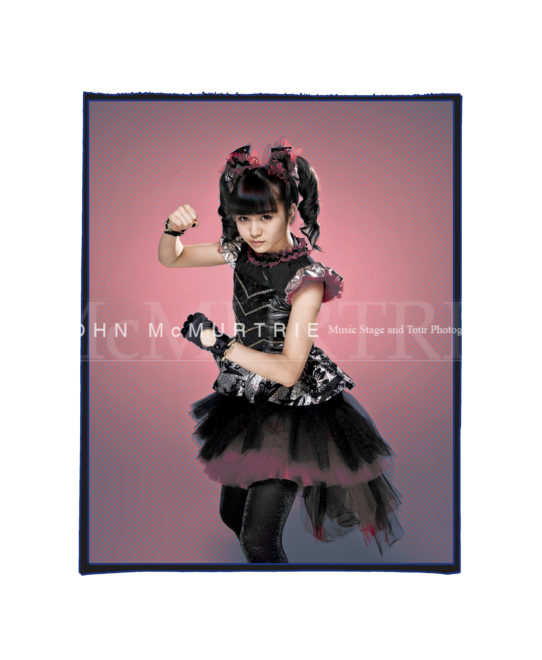
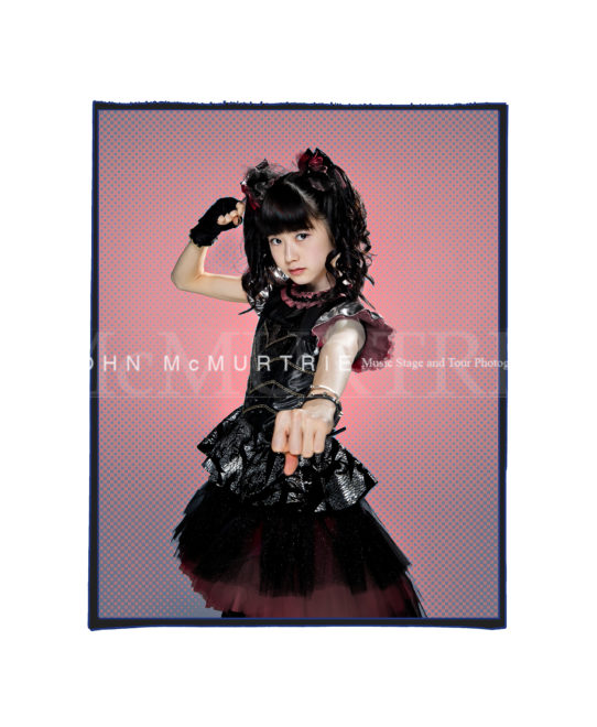
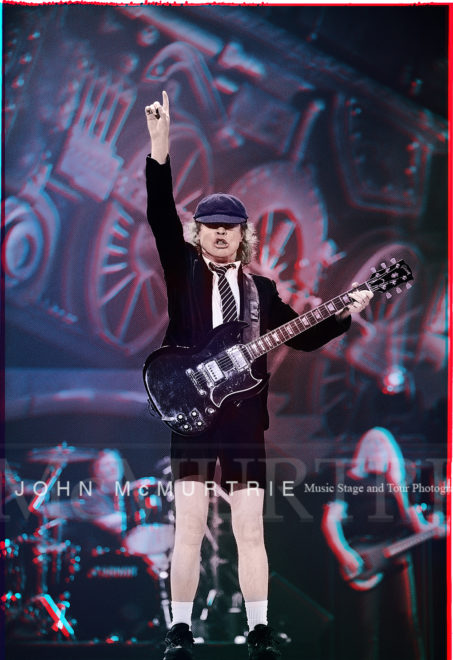
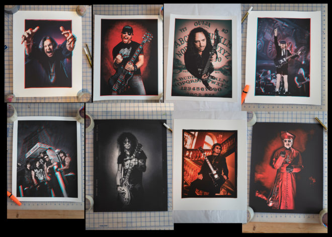
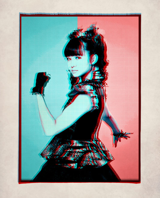
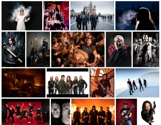
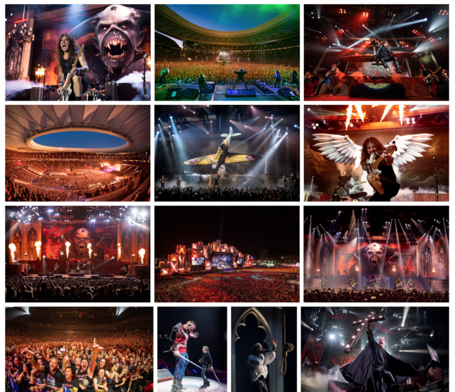
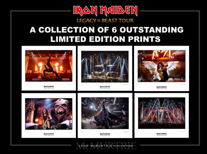
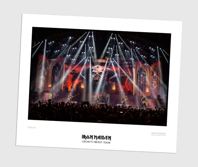
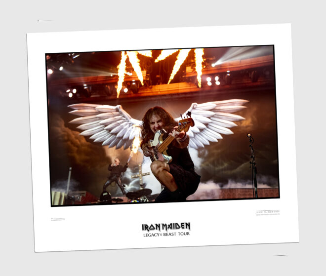
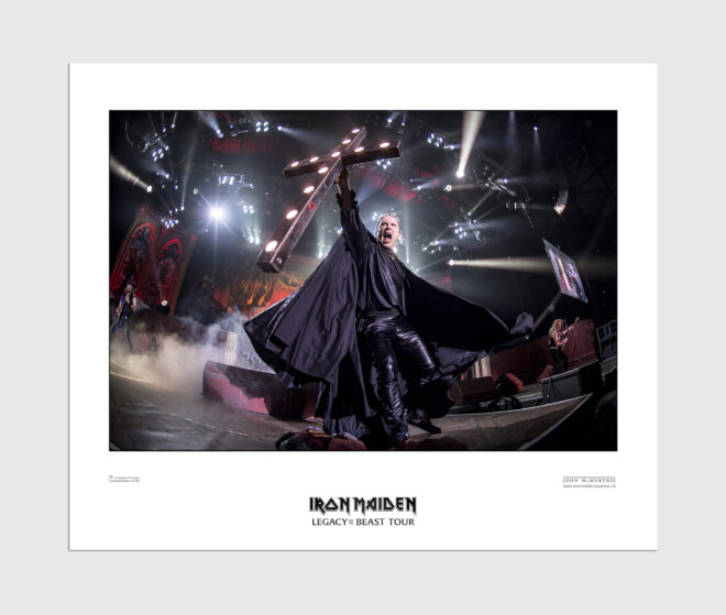
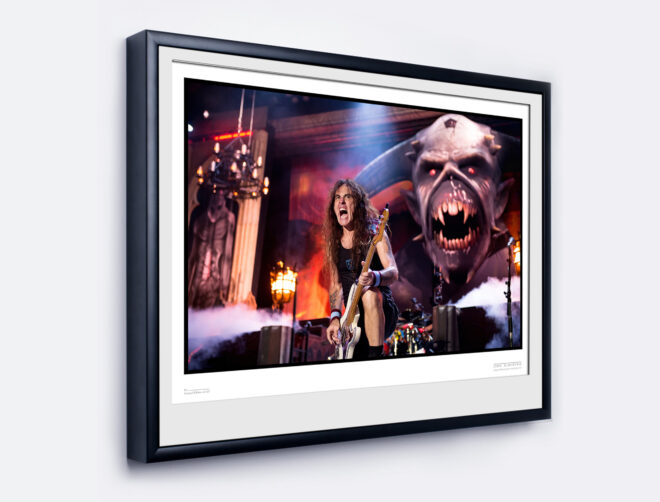
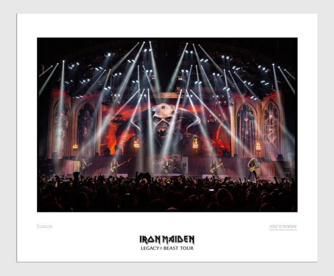
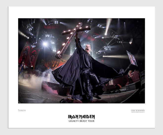
After numerous requests via email and repeated comments on Facebook and Instagram asking for IRON MAIDEN Limited Edition prints I have finally gone and done it! With amazing support from the band and management we have selected 6 (for now) that best represent the Legacy live show. Don’t worry we haven’t forgotten individual prints of Nicko, Janick, Davey and Adrian. Hopefully if everything goes well with these 6 we can roll out some further prints next year, including a few shots from previous tours. https://johnmcmurtrie.bigcartel.com

Firstly I have to explain a little bit about what makes these prints so special and why they may appear a little expensive. They aren’t exactly cheap are they? Sorry about that, but the paper I use is the best quality material I have ever used and unfortunately it is a premium. Yes I could have outsourced this job to an online print house and just thrown these out, but the quality would have been poor and after a year or two they would have faded. I also wanted to personally oversee the entire process from start to finish.

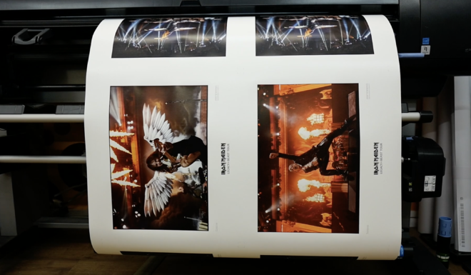
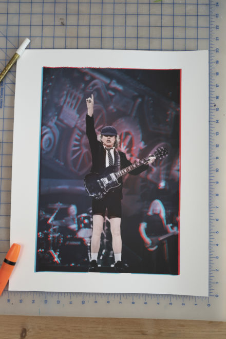
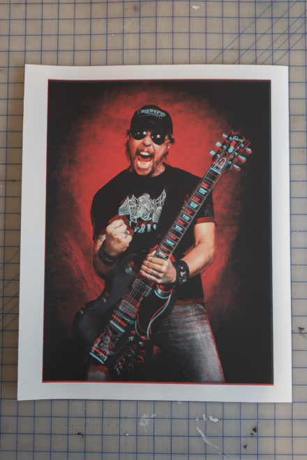
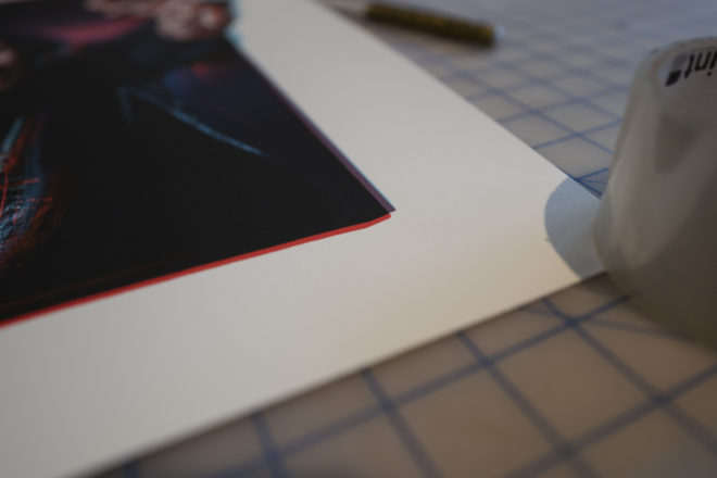
These are GICLEE printed on a monster 8 ink machine and will be archival for 200 years! The paper has a semi-gloss satin finish that feels exactly like a silver gelatine print. They are designed to be framed, put on display and I hope cherished. Obviously they are not for everyone, if you just want any old picture of IRON MAIDEN tacked on your wall then print one off the internet and you are good to go, I honestly won’t be offended. These are specifically designed for someone who wants a very special memory from the Legacy of the Beast tour and a very collectable piece of memorabilia on their wall. If you google ‘Limited Edition Music Prints’ there are very few under £500 and I have done everything to keep the price viable on both sides.

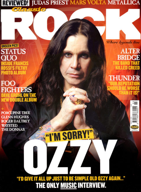
It is such an honour working for the greatest metal band on the planet. they have taken me on an incredible journey over the last 15 years. My pictures have been used all over the world in magazines, album artwork, promo posters and everywhere on the internet. After all these years I still get a buzz from seeing my shots published officially, so when the band suggested I should produce some official IRON MAIDEN prints I jumped at the chance, but only agreed if I could make the best possible Fine Art Prints.

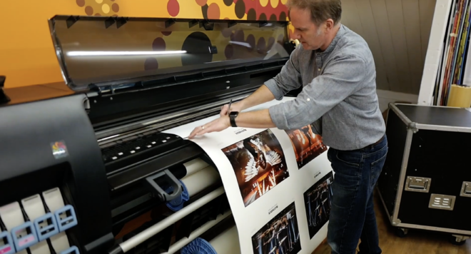
I asked my printer Roo at KANGAROOZ who has been producing fine art and display prints for the last 30 years to find the best paper to print live concert photographs. For most of my previous portrait limited editions I have used an incredible 100% cotton heavy weight paper which I love. The texture and quality is similar to a screen print but I knew this wouldn’t work for these Legacy tour pictures. Firing off a test print on standard photo paper produced blacks I didn’t like and the colours looked dull compared to how the image looked on screen.

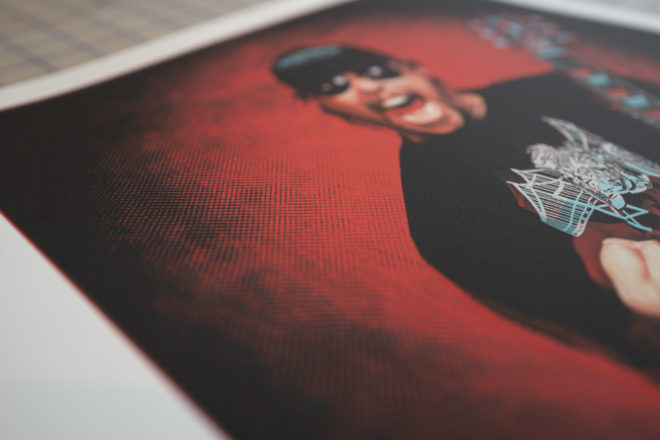
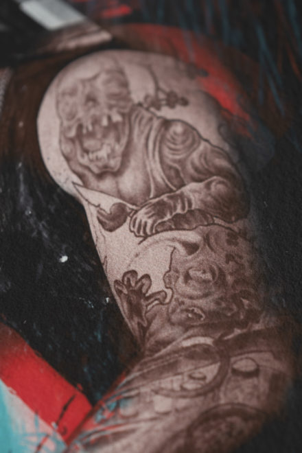
We test printed on the 100% cotton paper and we lost the contrast and saturation as expected. There was also less shadow detail which is something that I have tried to champion in live music photography for a number of years. A lot of live pictures you will see massive areas of black and blown out high lights. I like to see the detail in the shadows and high lights, something that makes a photograph look real. I wanted to produce prints that had the impact you see on screen with good blacks, whites, saturation and plenty of detail in the shadows. Without this I wouldn’t continue the project.

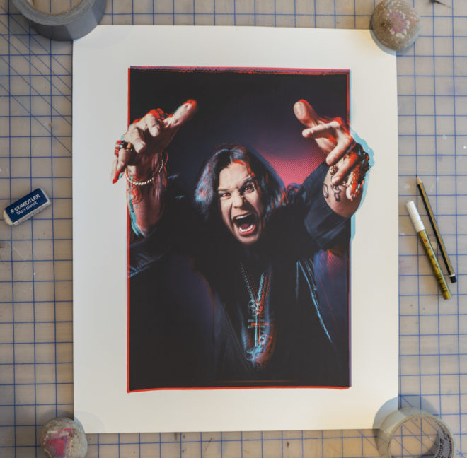
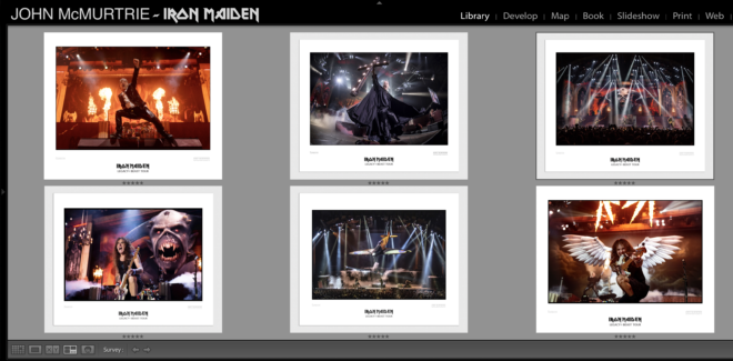
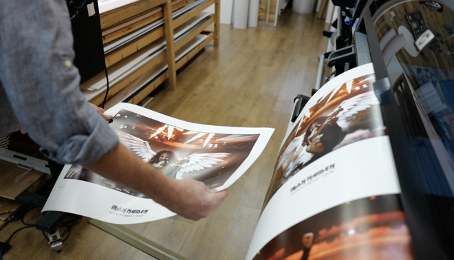
I left the problem with Roo in his studio in Sussex, England and made an image selection for IRON MAIDEN to approve.

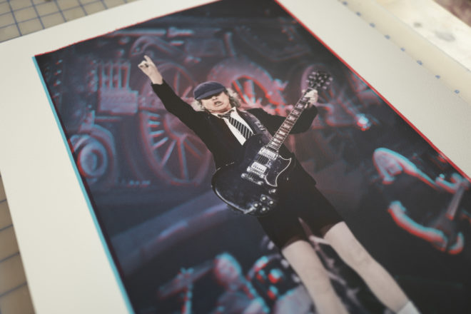
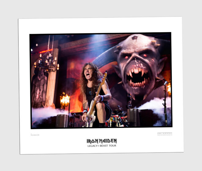
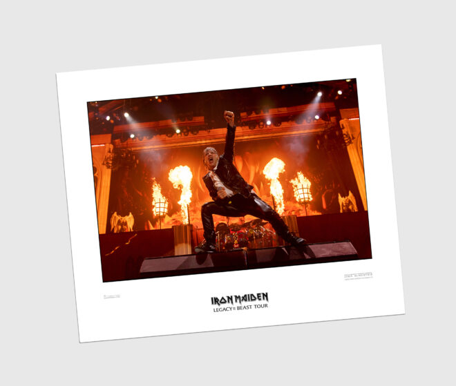
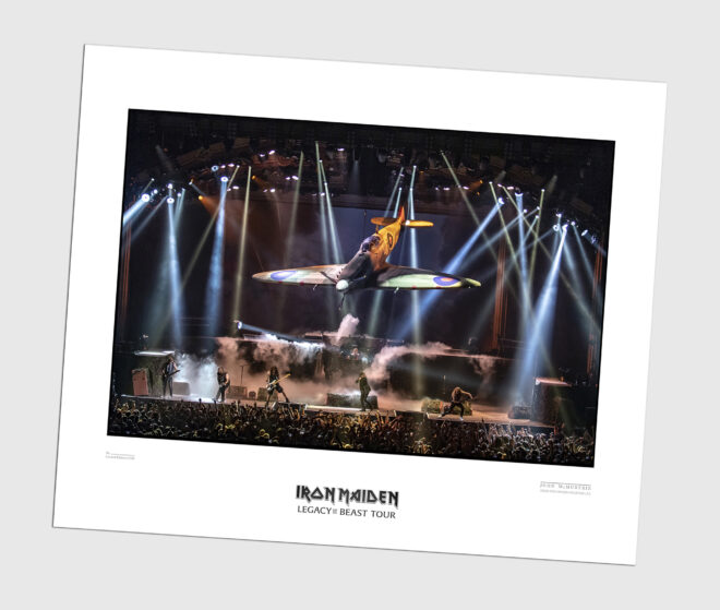
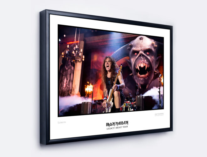
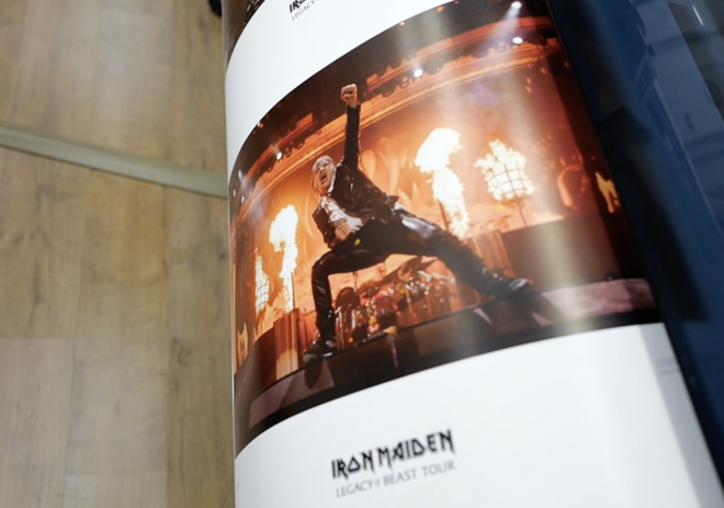
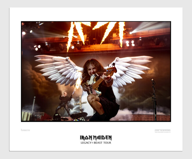
I wanted to produce the prints with a good sized border that had room for the IRON MAIDEN mast head and Legacy of the Beast tour title and enough space to hand sign and number each print. The way I have designed the border allows you to frame the print in one of two ways. You can flush mount a card border just under the numbering and signature or you can full mount the print and show-off the band and tour name.

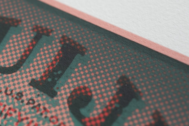
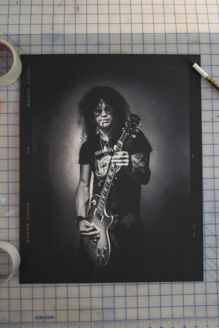
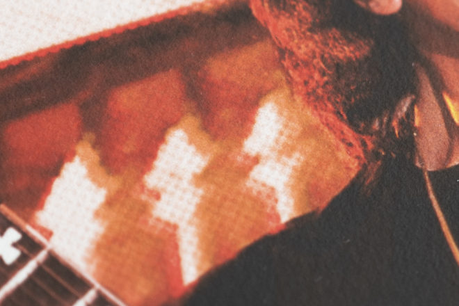
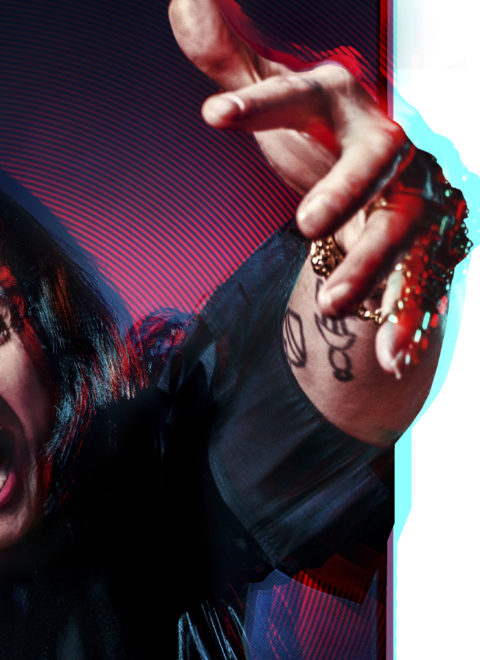
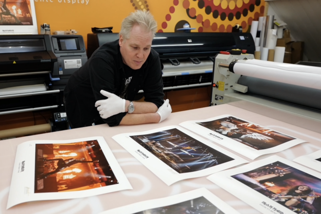
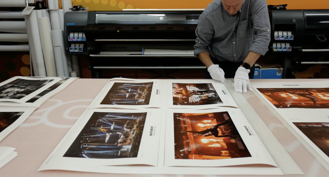
Each photograph was then re-edited from the original RAW file in preparation for CMYK test printing. Screen images are viewed in a colour space which is RED, GREEN, BLUE. Printing with inks the image is converted to CMYK (CYAN, MAGENTA, YELLOW and BLACK). Often the image colour and density will change when converted, sometimes drastically and this is why the print has to be tested, tweaked and tested again and again.

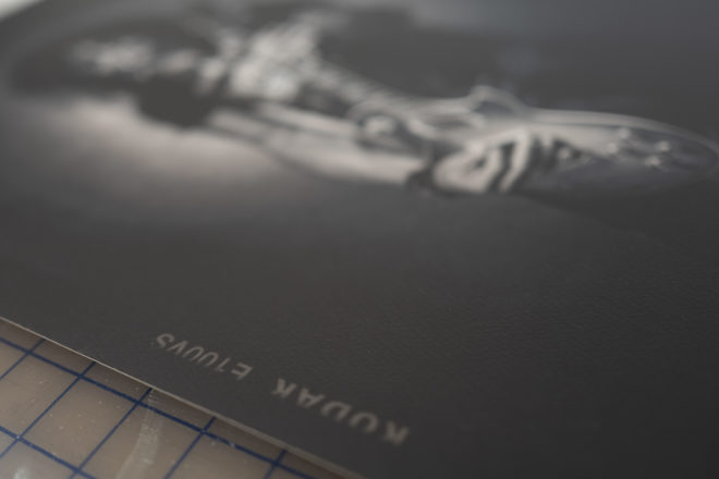
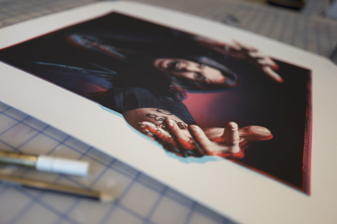
Roo did a shout out to every premium paper supplier in Europe and called excited about a brand new fibre based Pearl paper he had managed to get a sample. The material was recently used by a celebrated photographer for a one-off Limited Edition of DAVID BOWIE and the feedback was very good (each print sold for a substantially higher price than £105) . Along with the Pearl Fibre paper we also got rolls of a Titanium material and 4 other high quality papers.

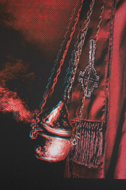
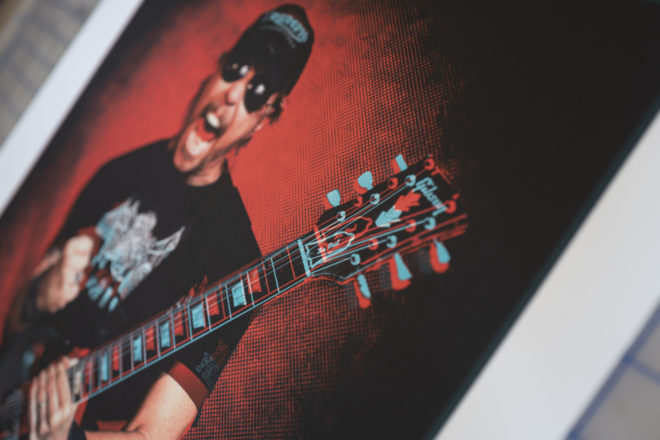
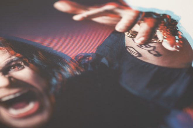
We tried them all but there was only one material that stood out from the rest and that was the Pearl Fibre that sat head & shoulders above the others. You can see the colours, the blacks, the shadow detail, clean whites and the texture of the material is virtually identical to silver gelatine prints. There is a slight silver effect when you view at different angles.

Then there is the saturation of colours that at last looked realistic This whole process sounds simple but in total it took close to 3 weeks. The printing studio is in deepest Sussex and I live just outside London so at least one to two days a week were spent driving across the county border to check sample prints. Roo is an amazing printer and we both had a shared goal on this project to make these prints the best they could be and he really has knocked it out of the park. Considering how difficult to please I was during the testing stage I am lucky I can still call him a good friend.

Test printing is an exhausting process because you are constantly tweaking colours, saturation, shadow and contrast and trying to judge when a print is better or worse. Some days you become snow blind and it is best to take the print away and judge at a later time. We then had to show IRON MAIDEN the prints and defend our decision to use such a premium paper.

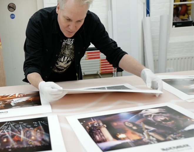
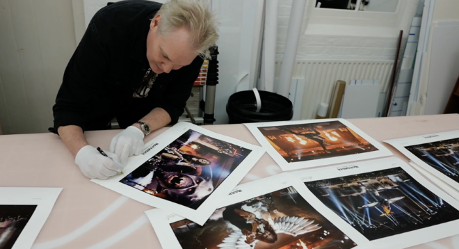
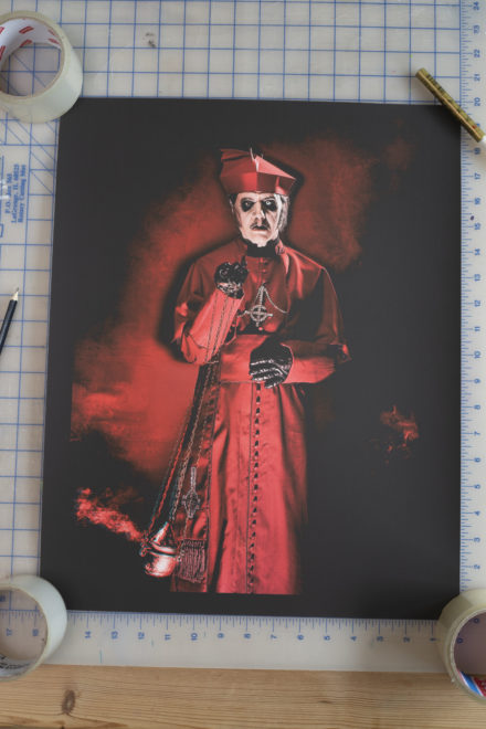
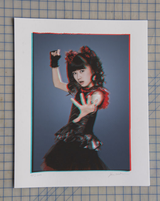
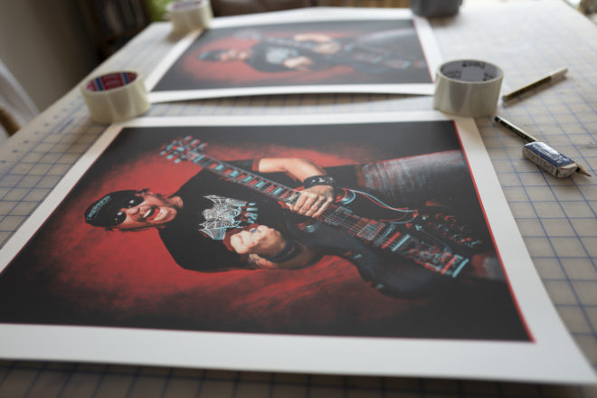
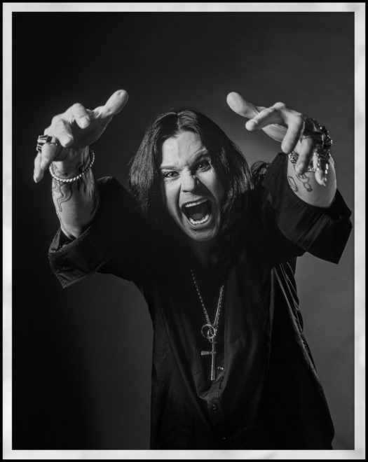
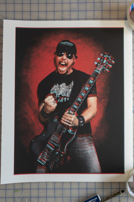
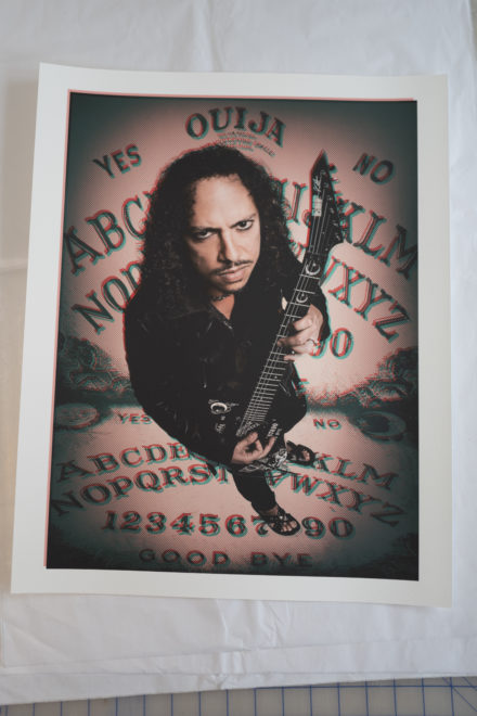
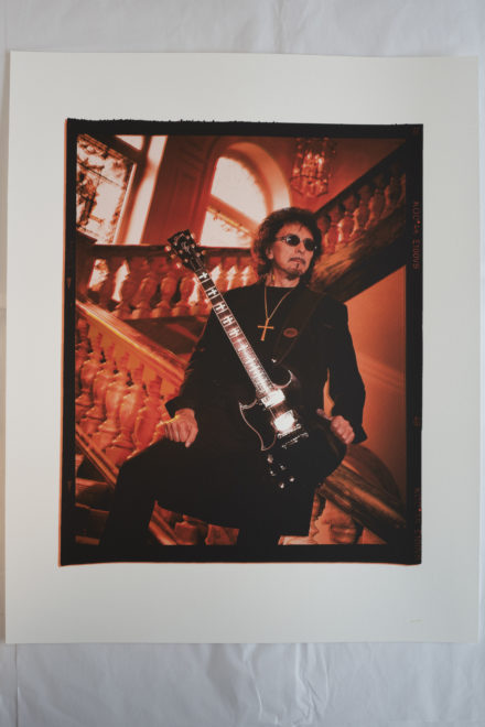
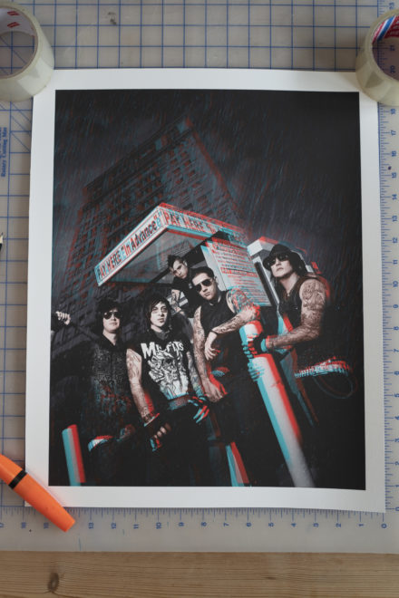
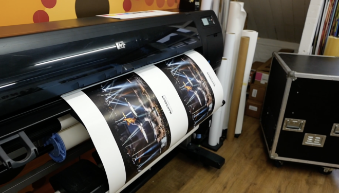
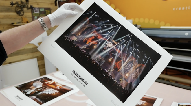
These 6 prints are without doubt the best I have ever produced. I am genuinely proud to put my name and IRON MAIDEN on them. Each one is signed and numbered by myself in gold metallic pen, issued with a certificate of authenticity and wrapped in tissue paper. The size is 20″x16″ (50.8 cm x 40.6 cm). As I write this they are being shipped all over the world (in heavy-duty thick protective tubes). So far CANADA, USA, SWEDEN, FINLAND, DENMARK, CHILE, GERMANY, POLAND, MEXICO, NEW ZEALAND, SPAIN, NETHERLANDS and of course the UK. Just a few ‘Aces High’ prints left in stock. Get yours at https://johnmcmurtrie.bigcartel.com

Posted in Uncategorized | Comments Off on Unleash the LEGACY of the BEAST Prints.

TOKYO DOT SU, MOA, YUI

Three completely new unseen portraits from the ‘3D Glass Smash’ METAL HAMMER cover shoot.

BABY METAL TOKYO PHOTO COPYRIGHT JOHN McMURTRIE

The last few Limited Edition print runs I have done of MOA, SU, and YUI sold out in record time and I regularly receive emails asking for more – especially YUI! I only decided to release these portraits because they have never been seen before and the eye contact and poses in each portrait work so well. After producing the Hateful 8 series of prints featuring OZZY, SLASH, GHOST, A7X, METALLICA, TONY IOMMI, AC/DC, I have been working on a few other portraits from my archive just for printing. These 3 prints came about after I was experimenting with the Tokyo Dot effect on a portrait of Dave Grohl. It looked stunning but the colour scheme just didn’t look right on the Foo Fighters frontman. BABYMETAL was the obvious choice. Unfortunately what I thought would be simple took over 3 days to reverse engineer from the Grohl portrait. The effect involves stripping the image down to separate tonal layers and preserving a master layer. I then replicate the background multiple times and overlay the Dot Screen. The process sounds simple but the effect is tailored to the specific image and what may work for one needs a different approach for another. The background layers are then multiplied and using ‘COLOUR DODGE’ and ‘SCREEN’ overlays, the background dot screen colours take on a life of their own depending on the tone and shading they are placed over. I then re-introduce the master image by using a layer mask to reveal the original beautiful portrait but preserving the background effects. The next step is to convert the image into the CMYK colour space and prepare the image for an 8 ink printing process.

Multiple layer processing
YUIMETAL close-up detail. BABY METAL TOKYO PHOTO COPYRIGHT JOHN McMURTRIE
SUMETAL BABY METAL TOKYO PHOTO COPYRIGHT JOHN McMURTRIE
BABY METAL TOKYO PHOTO COPYRIGHT JOHN McMURTRIE
SUMETAL CLOSE-UP DETAIL. BABY METAL TOKYO PHOTO COPYRIGHT JOHN McMURTRIE

These are made 100% with the print in mind and the images aren’t designed to be displayed on a computer screen. They come alive once printed and these 3 prints look so beautiful when admired on display. They are 20″x16′ (500mm x 400mm) and printed on the finest 100% cotton, heavyweight 330g paper. They are totally unique and I hope you are lucky enough to get one! At the time of writing this there are only 9 prints of each still available.

http://johnmcmurtrie.bigcartel.com/products

MOAMETAL BABY METAL TOKYO PHOTO COPYRIGHT JOHN McMURTRIE
YUIMETAL BABY METAL TOKYO PHOTO COPYRIGHT JOHN McMURTRIE

http://johnmcmurtrie.bigcartel.com/products

Posted in Uncategorized | Comments Off on TOKYO DOT SU, MOA, YUI

AC/DC ANGUS YOUNG 20″ X 16″ Limited Edition of 50 prints.

This print started life as a B&W shot. It was taken from AC/DC’s show at the London O2 in 2009 during the Black Ice tour. Although the B&W test print looked sensational I felt colour would bring it alive but the colours of the original lacked a little punch. Taking the B&W artwork I painstakingly hand tinted the image using a graphics tablet. Matching flesh tones and clothing colour from the original. I then applied a dot mesh to the background and airbrushed the red to blue effect behind. To create the ‘Tokyo Dot’ effect I knocked the red channel slightly out of register giving the dot ghosting to the background. This print has so much atmosphere and is a great portrait of Angus in action! Printed on the heavyweight 330g cotton paper really adds so much to the look and feel. It is a 20×16″ large print and limited to only 50. Each one is numbered and hand signed in pencil.

ONLY AVAILABLE HERE!

ONLY AVAILABLE HERE!

Posted in Uncategorized | Comments Off on AC/DC ANGUS YOUNG 20″ X 16″ Limited Edition of 50 prints.

The Hateful 8

OK where do I start? I have been on a mission for the last decade to create poster art from my photography.  Finally I am getting close!

8 NEW DESIGNS

Don’t get me wrong,  I don’t think I am trying to compensate for something lacking in my pictures,  I just think regular photo prints can look a little uninspiring when out of context. I am creating artworks using some of my best shots, but combining them with some of the techniques and effects used in the silk screen printing process. The idea is to produce alternative photo art that looks great hung on the wall. 

JOHN McMURTRIE PRINT SHOP

I am a fan of the poster art of Emek and Justin Hampton and have several of their artworks framed at home.  It is so visually arresting, colourful and look so good on the wall.  I love the saturation of their colours and the slight imperfections of out of register print. If I could apply those elements into a photographic print then I was convinced I could make something more desirable. 

https://www.emek.net/index.html

http://411posters.com/tag/justin-hampton/

First I tried screen printing my photographs which although the colours and effects  looked stunning, I just ended up ruining the photography.  With screen printing you lose all the subtleties a photograph has.  Even the tiniest silk screen mesh can’t display a good tonal range that is anywhere near the original photo.  That said the results were good but they didn’t exactly represent me as a photographer.  They looked more like a Black Flag gig flyer! What I did love was the vibrancy to the inks and the imperfections that you get from separating layers and printing tone using a dot mesh. Next I tried using some poor ‘one click’ off the shelf effects in Photoshop that just made good photography look bad.  I then tried experimenting with taking each individual property within an image apart and then reconstructing the image using multiple tonal layers and colours within the RGB spectrum. On reconstruction I added half-tone to certain layers and slightly moved layers out of register.   I had great results with some individual portraits of BABYMETAL which sold out incredibly fast.  The feedback was unanimous and the overall poster art effect proved very popular.  I named the effect ‘Tokyo Dot’ in honour of the Japanese trio and have now perfected the technique using it in various guises on some of my portraits.       

The effect used is definitely a manual technique and involves multiple hours of trial and error before an artwork is ready for print, but I adore how the artworks look.  They are unique and not like anything I have seen anywhere else.  They look like Silk Screen prints but don’t detract from the original photograph. They look amazing framed and stand up well as art and still have that original photograph on the wall feel.

McMURTRIE 2020 Photo copyright by JOHN McMURTRIE

The Ozzy Osbourne Limited Edition print was taken from an out-take from a front cover portrait shoot I did for classic Rock.  It was shot in London in 2004 and my direction that day was to shoot a more under-stated Ozzy.  I think the editorial angle was suggesting Ozzy was apologising for the reality TV years! 

Ozzy doesn’t exactly do under-stated and he is a dream to shoot, like a professional model giving you pose after pose!  It was all shot on 6x7cm medium format film and all the crazy shots were cast aside in favour for a more sedate Ozzy on the cover.  I recently came across the over-looked frames in my archive that contained all these amazing portraits and I knew I had to make a print.

McMURTRIE 2020 Photo copyright by JOHN McMURTRIE

The first step was to make a high-resolution quality digital scan from the original transparency.  I then separated the image into multiple layers.  Shadow detail, highlights, lowlights, Blacks are all isolated and then multiple layers are made of the RGB colours.  A master layer is preserved throughout to be used to bring back detail when something is unintentionally lost. Adding a mesh dot to an isolated colour and then knocked slightly out of register creates a vibrant ghost effect when combined with the original image.  I did this effect to the Red and Blue channels and added a circular mesh to the background.  Areas where the integrity of the photography were compromised I painstakingly removed by hand using a pen and graphics tablet.  I then re-combined the original image with the background effects and added a Sabbath inspired Purple hue.  The original photograph has a lot of animation to it and Ozzy’s hands reaching out make it almost 3D.  I thought it would be fun to have Ozzy overlapping the framing just to add some exaggeration to the image.  The red glow in Ozzy’s eyes came from an accidental mistake whilst knocking the red channel out of register.  I kept the eyes like it but preserved the tone on his face.

In all, there were 35 different saved versions before the finished artwork was complete and in total this took 5 days.  If you asked me to do exactly the same effect again from scratch I probably couldn’t, it is that organic.

Although satisfying to complete, the next step is the laborious task of transferring what is on screen to paper.  I only use 300g heavyweight 100% cotton paper for all my prints because it is the best material for printed art. The printing is GICLEE fully archival and won’t fade. The material is more like water colour paper and nothing like a normal glossy photo print.  The Professional Printer I use knows me well and knows exactly the finish I want to produce.  With over 30 years of experience in photo display printing Roo@Kangarooz brings a wealth of knowledge and good advise each time we produce a Limited Edition print together.  Firstly the screen RGB original is converted into a CMYK file that matches the printers profile.  This is a delicate stage which often requires adjustment to each individual colour to create the vibrance found in Silk Screen printing.  8 inks are used in the printing process. Several small versions are run off at different settings and once approved a large format 20”x16” is made which I then take away to check in different light conditions.  Often a print under the bright daylight illumination of the studio can look very different when viewed in tungsten or low light.  Normally a few changes are made to the density and saturation of the first print and then the A/P (artist proof) print is made and this is what is used as reference for the run of 50 Limited Edition prints. Once happy and everything is approved the studio then begin the print run and each print is trimmed by hand.  I then personally sign and number each print and they are placed between acid free tissue paper.  Each print goes out with a simple Certificate of Authenticity detailing the individual number in the edition and its prominence.   From start to finish the Ozzy Osbourne Edition has taken nearly a whole month of design and printing.

McMURTRIE 2020 Photo copyright by JOHN McMURTRIE

All the prints are part of a strictly Limited Edition of 50. The print run is independently verified, all prints are hand signed and numbered by John McMurtrie. Once gone, they are gone!

GET YOURS NOW!

McMURTRIE 2020 Photo copyright by JOHN McMURTRIE

JOHN McMURTRIE PRINT SHOP

Posted in Uncategorized | Comments Off on The Hateful 8

Where do we go from here?

So the brilliant ADOBE PORTFOLIO app allowed me to build a new website very easily. I still need to tinker with a few sections and want to add a ‘GUITARIST’ gallery, AVENGED SEVENFOLD gallery and of course an IRON MAIDEN dedicated section (I have a few good ideas for this area). Pulling out all the shots I like (and have good memories shooting) has left me with mixed feelings right now. Seeing 50,000 Maiden fans screaming at the top of their lungs makes me smile but of course I am missing it – like everyone else is. I have always kept a good control of my career and where I am heading, but for the first time in my life I don’t know what to expect next? In theory a vaccination or a cure or successful treatment could change everything overnight, but I think this Pandemic is going to be with us for some time to come! My strength has always been my ability to be dropped anywhere on the planet and ‘get the shot’, whether that is by building a mobile studio or carefully persuading an artist to come to a great location. Not always easy or possible (**Volbeat** cough cough). Suddenly all bands movements have been frozen and no one is touring, playing or promoting, so I am very suddenly out of work. It isn’t just me I am feeling sorry for, but I think all freelancer’s and creatives who have carefully carved a career for themselves are now unceremoniously out of a job. Let’s just hope things change soon or this website will become my ‘greatest hits’!

Posted in Uncategorized | Comments Off on Where do we go from here?